UX principles - Is it all just fluff
I used to think that UX principles were a bunch of fluff without any substance. I was Startup Aditi on a metaphorical rocketship. Let’s just go faster! I thought.

I used to think that UX principles were a bunch of fluff without any substance. I was Startup Aditi on a metaphorical rocketship. Let’s just go faster! I thought. I had already helped build successful products and businesses over a 15 year career in product design. For e.g. I’ve worked with high growth, successful SaaS companies like Calendly and Postman before they became successful and famous.

And what I’ve seen is that it goes really, really fast with small lean teams of 20 people who know what they are doing. These products that we built are being used by millions and doing really well today without writing any fluffy principles. So yeah why do we need UX principles anyway?

4 yrs ago my perspective changed and I started to learn about UX principles.
So today I want to share some practical stories and examples on how UX principles can help you in your day to day life as a designer or product person. This is a long form visual essay so you can jump to a section or scroll the entire thing whatever works.
Jump to:
One of the things I used to think as a design leader- why try to get the principles right when you can just ship, ship, ship and learn from reality about whether the product worked in the real life market.

The reason I was skeptical. Is that whenever I had encountered principles before, there were usually hung up on office walls and posters and didn’t really influence how we worked on the real product or our process. These cool sounding principles were in our presentation decks to investors but not used in projects.
There were really nice and inspiring, but they weren’t really useful when it comes to real outcomes
What is a UX Principle
A lot of my initial skepticism started from a misunderstanding of what a UX principle was. Values and principles are often spoken of in the same breath so let’s first understand the difference between these two things.

Values are qualities or standards of behaviour. They help us form principles. Principles are rules or beliefs that govern our behaviour and they are based on values.

Values are more subjective and spark conversation. Principles are more strict, like rules or guard rails.

For e.g. Honesty is a value. A strict principle based on honesty is “Don’t ever lie, not even to prevent harm.”
Examples of company values and principles
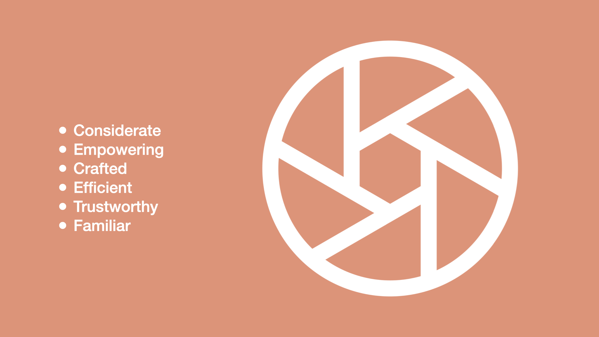
Another example of values are these UX values from Shopify, which you can find on the Shopify Polaris design system website. The values are: considerate, empowering, crafted, efficient, trustworthy and familiar. These values are subjective and spark conversation. They are a lens through which the UX team at Shopify can critique and discuss their work.

My diagram is based on an illustration from here
So you can have these personal values and principles at an individual level and then you can have product values and principles which help guide a team or an organisation or a company like Google or Apple towards a specific direction.
The principles we are talking about today are the values and principles around how to build product and design things. We are not talking about your personal values & principles here.

Don’t make me think! This is an example of a product principle from Slack. They have crafted 5 principles based on their product philosophy as an organisation and this is one of them. It’s an important rule that guides how their product organisation makes things
So the 5 principles or rules are distilled down to:
Don’t make me think
Be a great host
Prototype the path
Don’t reinvent the wheel
Make bigger, bolder bets
Having just 5 concise rules makes it very clear what Slack’s product org values and how they think about software design and development. The fact that these are the 5 principles and not any others tells us a lot about what this organisation values and how they want to function when they are designing software.

Another example is this design principle from Apple for iOS. Direct manipulation of onscreen content through gestures, people can see immediate, visible results of their actions.

Facebook had a principle to move fast and break things. Eventually they changed it as the company changed and that’s okay too.

I really like this set of design principles by Intercom:
Connected modular systems
Opinionated by default, flexible under the hood
Follow fundamentals
Make it feel personal
What you ship is what matters

My favorite one is - Opinionated by default, flexible under the hood. What this means is that they optimize their designs to feel simple and opinionated by default, but progressively reveal power and flexibility.

So this is the full picture I’m painting here. We have values, on top of which guiding principles are created. Decisions in a team or an organisation are made based on this foundation.
Principles can be product principles, UX principles or both.

Don’t forget, the way I’m talking about it here is that everyone works on the product. It doesn’t matter if you are a designer, data person, product person or engineer - every person is working on it in some way or the other.
So principles are super foundational.
Difference between product principles and UX principles
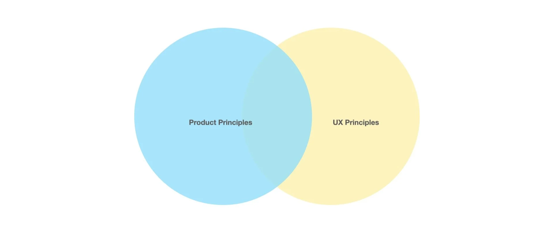
What about the difference between product principles and UX principles? One way to see it is that product principles apply to everything in software development but UX principles are more specific to our craft as designers.

Both are foundational principles and guard-rails, they just look a little different.
So to summarize,
A UX principle is a guiding rule or a guard rail based on an organisations values.
A value is more subjective like “Simplicity” and a principle is a more specific, stricter rule based on that value like “Short beats good.”
A principle is foundational - it can be either a product principle or a UX principle or both.
It can be a foundational tool for your design approach - its not all fluff, at least that’s what I’m trying to convince you of :D
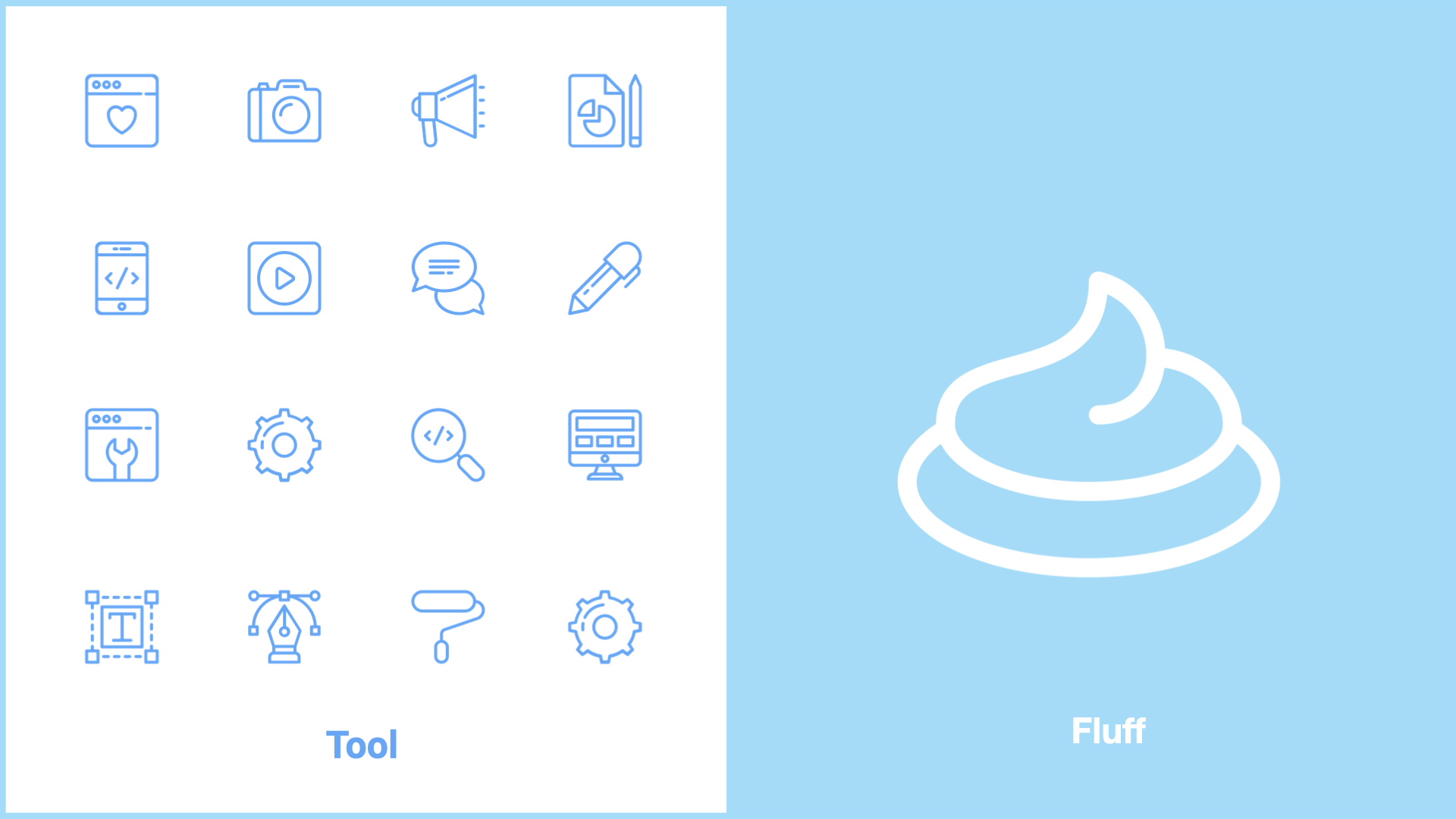
What I’m trying to convince you of is that a UX principle is a tool. It’s one of the many tools in your skill set as a designer. It’s not just a bunch of fluff :D
6 signs you need UX principles on your project or team
Lengthy, repetitive debates and,
Passionate, spicy topics and themes
A common situation is that there are lengthy debates about design decisions in your team, which often repeat themselves in topic and theme. Maybe even some spicy debates, topics people are really passionate about like data privacy.

Okay time for a story and a detail project level UX principle example.
My team was designing a modal that helped Shopify merchants choose their data preferences when they installed an app. This was a tough challenge because of the natural tension between privacy concerns and the merchants need to share data for various features to work properly. The choices they would make would impact how their app functioned and would impact their bottomline, sales and GMV.
How do we communicate to the merchant so they can make the best decisions, without bombarding them with too much technical information?

So my team came up with this principle which is - data sharing is a preference, not a technology choice.
Let merchants choose their comfort level, rather than a specific technology. This helps merchants make an informed choice, without having to understand technical jargon. It also future-proofs their choices, and lets us add new technologies that match their preferences
This is a product principle and a UX principle.
It has helped us make so many design decisions since then and continues to be useful today. We have also shared it with our partners to help them understand why we don’t want to say “server side apis” in all our content design materials
3. Complex, large org structures

Multiple teams with multiple layers working together need to communicate their specialised knowledge and decision making patterns. For e.g. we understand intercom or Slack a bit more now that we know how they approach their decision making for their product. That’s an entire org of 100s of ppl that we know a little bit more now
4. Fast growing team

Another sign you need UX principles is - your team or org is growing super fast. New ppl are like what’s going on.
Remember Startup Aditi? I didn’t need UX principles because we were working in small lean teams of 20 people. We were working closely with founders all sitting in the same room. Everyone implicitly understood our goals and absorbed ways of decision making. The moment you scale into huger orgs though, you have to communicate this stuff somehow.
5. Remote work and normal working hours

Tbh. I didn’t need UX principles because I was working 16-18 hrs a day in the office LOL. When we are working remotely and healthy work hours we need other ways to communicate our decision making patterns. Instead of just getting on a call every time a discussion needs to be had.
In a more mature team you want to be able to communicate decision making patterns async instead of “jumping on a call” and interrupting everyones work every time a tough decision needs to be made :D
6. Product team or RnD team
Another sign that you may need UX principles is that you are a product or RnD team.
A product team or an RnD team needs principles. If you are an execution focussed feature team, you don’t need principles that bad because decisions have mostly been made already. So principles are important for teams that are driving their own ship and choosing their own path.
So to summarise, you probably need UX principles if:
You’re having lengthy repetitive debates
Passionate, spicy hot topics keep popping up
You’re a fast growing team and new people want to contribute quicker
You’re in a remote work situation
Or even if you’re in a complex large team structure, cross company collab
Again, principles are important if you’re a product team, not if you’re a feature team
How UX Principles help you and your org

Design principles helps us make decisions, and reflect how we process information and how we communicate. Instead of focusing on the technique and process of design, we want to focus on design principles here.
A good UX principle is not open to interpretation. It’s specific, concise and contextual. This provides helpful guard rails for the team. People need this guidance, they don’t need another debate.
A UX principle can be emotional and inspiring. So it helps the team connect with goals, values and decision making patterns in a meaningful way.
If the principle is high level, it may also help the design team connect with the company’s brand story.

This is the famous owl meme. As creatives a lot of times we are asked to draw an owl in this way. We may have some initial direction of draw 2 circles. Then all the other steps have to be filled in by us. Good UX principles are tools to help you and your team along the way :D
A UX principle communicates how your team thinks so it can help with alignment across complex org structures. For e.g. when it came to this principle around data sharing as a preference, it helped us align with multiple teams and functions including our external partners outside Shopify.

When using these principles with partners, it’s not always smooth going. However it helps spark an important debate and conversation that helped us either strengthen our principles or come up with alternative tactics to work with other teams.
Reframing: Exposing our project principles to other teams and companies helped us reframe the principles and improve on them faster whenever needed.
In many ways this underlines the philosophy that design should start with words.
Before jumping into the UI we should think about how we want to approach the work and articulate it and get alignment.
How to write UX principles
Tips on writing UX principles and improving your current principles
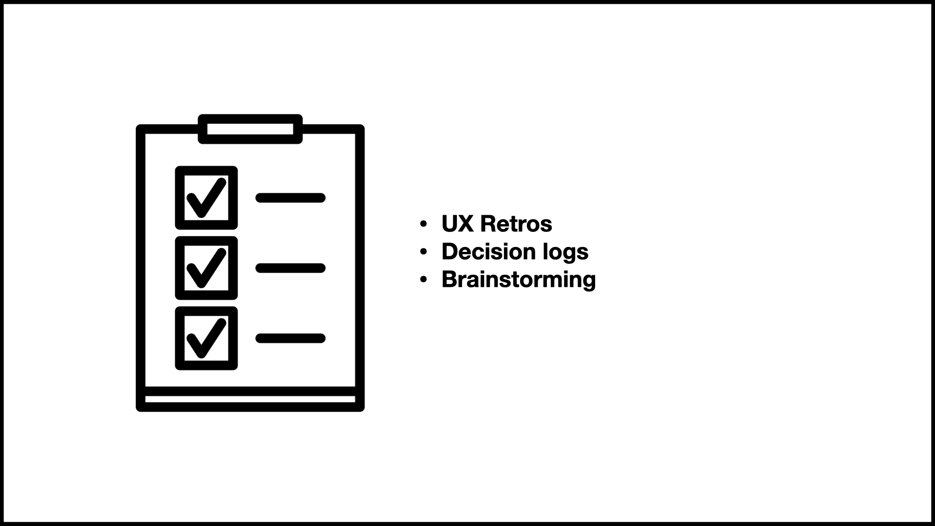
1) Investigate your decision log and run UX retros
First write down all the tough decisions your team has made recently. Most teams have a decision log you can refer to. Identify all the decisions that didn’t immediately come from existing principles and missions you have articulated already. This is where your principles will come from.

Your principles should be the bridge and fill the gap between the high level vision, the 10,000 foot vision and the day to day design process.

2) Test your principles with other teams to check if your framing is truly helping to settle debates and communicate your intentions in a way that connects with the values of the company.
So for e.g. every time we went to different teams with our project principles, we got excellent feedback on how we could do this better.
One way to test is to write the opposite principle and see if it makes sense. For e.g. the opposite principle of
“We create a seamless experience” is:
“We create an erratic experience”
Hmm not so helpful lol. Make sure your principle is actually very specific and helping the team make decisions during tough, repetitive debates.
3) Take a writing course, hire a writer and generally get good at writing. Really good framing and articulation is essential.
Consider project level principles first, start at a smaller complexity level before trying to change your entire team. One baby step at a time. If we can come up with principles that reflect the company’s values, and help our teams make better decisions, only good things can come out of it :D Maybe I sound too idealistic saying that!
Summary
A UX principle is not all fluff!
It’s a guiding rule that informs our design choices
These concise, specific guidelines are tools that can help mature, product teams settle repetitive debates, communicate vision across complex scaling team structures and help people understand their decision making patterns
You can write UX principles by investigating your decision log, running UX retros, testing with senior stakeholders, and getting better at writing.
Most importantly, these UX principles should be fun and help inspire the team and make things easier for them during tough decision-making times.

Thank you so much for reading this far! I would love it if you could DM me on Linkedin your favourite UX principle - from anywhere on the internet, your favourite company, any projects you’ve worked on.
It’s okay if you’re not sure if it’s a UX principle or not. I would love to hear from you!

This article is based on a talk I gave at the UX+ Conference in Manila in 2023 to 2000+ people.
Reference materials:

Navigating cultural complexity at work
Working in a team with leaders that acknowledge differences is like coming to an oasis after a lifetime of being in the desert. You can create this workplace oasis if you know how to navigate cultural complexity as a leader. Check out some practical tips

Working in a team with leaders that acknowledge differences is like coming to an oasis after a lifetime of being in the desert. You can create this workplace oasis if you know how to navigate cultural complexity as a leader
As a design manager I have managed teams across India, Japan, Australia, Europe and North America and I’ve also had the privilege of living across Asia, Africa, US and the UK. This makes me a bridge person - someone who is a bridge between cultures. And uniquely qualified to share my learnings and tips on how to navigate our differences. I hope this guide helps you and inspires you
This is a long form visual essay. You can jump to the sections below or just scroll to read:
Cultural differences are not so simple
So much information on cultural differences is overly simplistic and limited. One of the biggest mistakes leaders make is thinking it’s easy. This hubris is the beginning of bad policies. Here are some excerpts from the official corporate training I was given on how to interact with our American colleagues when we visited the US for work:
Strong smells are offensive to Americans. Make sure to avoid disturbing your western colleagues at lunch time
A meeting scheduled at 9AM starts at 9AM. Be there 5 mins early.
Don’t use the company’s phones to call your parents back home in India
Wow, so many assumptions to unpack here. This is what we were told as Indians visiting America for the first time for work.
I have a few more examples of overly simplistic cultural differences I want to call out.
They say that culture is binary (it’s not)
One culture is egalitarian and one culture is hierarchical

One culture thinks time is relative and the other culture thinks time is money

One culture is “free” and the other is “traditional”

One culture has small egos and in another culture everyone has big egos

But culture is not so binary!

Our cultural differences are rich, complex
These differences are difficult to decipher. This is okay. Let’s take the example of eating on a video call at work. One day I asked:
What’s everyones opinion on eating on a video call?
We were a group of people who worked together for a long time. And we were all surprised and curious by each others answers. Some folks were just not comfortable eating with their camera on, some thought it was too informal for work, some were practical and said better to get it over with if you’re having a busy day. Others were totally comfortable with it and hadn’t thought twice about it

acknowledge cultural differences
Acknowledging our differences is important. Celebrate them!
Working in a team with leaders that acknowledge differences is like coming to an oasis after a lifetime of being in the desert

Cultural differences are not a problem
What I’m getting at is that cultural complexity is not a problem to be solved. It’s a world we need to navigate.
When we switched to a digital first world during the pandemic everyone focussed on how to optimize remote work. They told us to overcommunicate, focus on work/life balance and we even tried to come up with new ways to have fun as a team. We discussed the new digital etiquette in meetings. For e.g. is it okay to eat on a video call.
When we add cultural complexity to a digital, remote world everything becomes even more layered. Earlier everyone left their home behind and came to a common space, The Office. In the office they absorbed office culture. This made it easier to communicate across cultures. However working from home means we were all in our homes, full of our families, our pets, language and food. We are embedded in our cultures when we work from home
Everyone is different - this was always true. However our differences become more visible in remote work. Some of us are caregivers, some of us have loud construction noises in the background. Others have kids, pets, parents, family needs, some are alone at home, some are in big houses with huge backyards and others in small apartments in big cities. Some want to eat hot food for lunch and others don’t mind a cold sandwich. Some can do flexible timings while others have to stick to strict schedules
In this situation it becomes more important than ever to bridge the gap
Bridge the gap to create a workplace oasis
When you do this you create an oasis. A space for everyone to be different and yet welcomed, a safe space.

A space where trust batteries are charged up to the maximum. More, better ideas are generated and people are more productive. The best ideas come from diverse teams that get along very well and work together for a long time. When you can navigate across cultures, celebrate differences and bridge the gaps - you create a workplace that encourages creativity and idea generation
To summarise:
Cultural differences are complex, not simple. In the media and everywhere we often limit cultural differences to oversimplified tropes.
I want to convince you that we should acknowledge and even celebrate cultural complexity. It’s not a problem to be solved
When we learn to navigate cultural complexity we create an oasis for creative people where more, better ideas are generated, faster
Okay so how do we create this idealistic oasis full of ideas!
Here are some tips to become a bridge person or...

How to bridge the gap
Being a bridge person is a bit like being a chameleon. I had to adjust and survive in so many different contexts and cultures that I got good translating between cultures. You can do this too!
I learned the term bridge person from Lola and Farai when I did a talk with them on Bridging culture in design on Shopify UX’s official podcast in 2022
There’s a bunch of effective strategies you can use to start becoming a bridge person and make your own workplace oasis:
Drive

You need to want to create the oasis. How willing are you and your organisation in making online and offline work spaces friendly to all cultures? This requires flexibility, persistence and engagement. Get confident and go for it!
2. Awareness
The second step is awareness. Your cultural intelligence is a result of how much you pay attention and learn from your every interaction. For example, I once got an email from an American client that said one word: “Great”

We had spent months working on an iPhone app and at the end of the project when we sent the final final version of the app across to Rob, our American client. His response was this one word email without a period or exclamation mark. The team was pained and confused because as a high context Indian culture we found it to be very abrupt and rude. All that empty space must mean something, right? We didn’t know if he was happy or upset with the work. Eventually we found out that he was actually happy and meant it in the most straightforward way possible. These incidents get added to my “cultural intelligence” as I learn more about a new culture. I don’t expect this blunt straightforward communication from every American. I’m aware there are complexities within American culture. However the next time I get an abrupt one word email, I won’t jump to conclusions. This is cultural intelligence.

Another way to increase your cultural intelligent is to know your bias. This is not a competition on who has zero biases. Everyone has some, let’s just get self aware. You can do all the tests here on the Project Implicit website by Harvard. It’s free!
3. Action
The third step is to take action. Adjust your verbal and non verbal behaviours based on the room. For me personally this is the hardest part. I sometimes feel like I have a lot of awareness but don’t always act on my cultural knowledge as well as I should
Something I struggle with personally is conversational styles. I have learned that my style of conversation is called cooperative overlapping. I found out about this through twitter at first and then clicked through to find this book on Conversational Style by Deborah Tannen.

In my culture, we often speak over the other person before they have finished speaking. This isn’t to be rude or interrupt the other person but it’s a signal of enthusiasm and interest in what the other person is saying. I’m adding on to you what you are saying because its so engaging and exciting. It’s called cooperative overlapping
Cooperative overlapping conversation style is found not just in India, but in some other south asian cultures as well as mediterranean cultures - and even in New York!
However if I do this to someone from another culture they will view this as a sign of disrespect. A lot of cultures take turns speaking, and depending on the culture there are comfortable pauses between each person who speaks.
The action I took for this - is to make space for turn takers and overlappers. Although I still struggle to this day I observe the group and do my best to balance my interrupting enthusiasm with turn taking.

Another thing I’m learning to do is to interpret silence correctly. In some cultures, silence demonstrates that you are attentive and engaged. In others, silence indicates disinterest. If you’re from a culture that uses silence to show engagement, you might need to “jump in” faster. If you’re from a culture that shows interest by interjecting, you might need to pause more often.
To summarize:
So first is drive - get motivated
Second is awareness - develop your cultural intelligence
Third is action - Adjust your verbal and non verbal behaviours

The fourth step is to get comfortable with ambiguity. Which I think should be a bit easier for creative people, designers and this audience
And get a sense of humour!! :D

The fifth step is to create your personal blueprint. Write down what it’s like to work with you, your communication preferences and your preferred work-times. Write as much detail as possible and share it with your entire team.
Your blueprint will help others navigate and work more easily with you

This is a ways of working map
Blueprints and maps help people navigate
Get your team to discuss how they like to work so they can learn more about each others differences and appreciate them. This will help people become more self aware of what they prefer and be able to create their own blueprint.

The sixth step is to identify an official ops person who helps communicate between teams in different cultures. If the gap between the teams is too wide this person (preferably a bridge person) can maintain harmony and provide a safe space for discussing issues on both sides
That’s it! If you reached all the way here, omg thank you so much for reading!! Please add your own stories about inclusive and not so inclusive spaces in the comments below
To summarize (again):
Today I shared some of my stories and thoughts on navigating cultural complexity at work. People view cultural differences in simplistic, limited and stereotypical ways. However, culture is complex and acknowledging differences is key. Working in a team with leaders that acknowledge differences is like coming to an oasis after a lifetime of being in the desert. Cultural complexity is not a problem to be solved but a beautiful world we need to learn how to navigate.
Building an inclusive space for different cultures creates a creative, innovative productive space for more ideas and idea generation. But how do we build this inclusive space across cultures?
You can create these inclusive spaces by:
First, getting motivated to do this
Second, getting aware and learning from your every cross cultural interaction.
Third, taking actions on verbal and non verbal behaviours. For e.g. I became aware of my conversation style called cooperative overlapping. And then I worked to make space for others based on this. Become a bridge by slowly learning more with every cross cultural interaction
Getting comfortable with ambiguity will help you get better at this and assume positive intent during miscommunications
Design your interactions by using blueprints, frameworks and tools so that people from other cultures around you can understand how you work, and how you communicate. Making it easier for people to navigate across cultures
[This article is based on a talk I did at Design Matters Tokyo in May 2022]

OMG! Finally breaking 3 year break on my blog
Yes Covid hit me hard

Yes Covid happened. Layoffs happened. Although I did a lot of talks in these 3 years I lacked the energy to convert my design talks to articles which is my usual process. I finally regained some of my mojo this year and will start putting my talks to writing again. It’s so important to articulate my learnings to share with others and for myself

Design & Drinks
Quick documentation of two Design & Drinks events I helped host and organize in Singapore
We hosted two design events at our cozy ReferralCandy office in Block 71 while I worked there.
Looking back, I realized I’ve participated in several design meetups, conferences and events but never hosted my own. With the teams support it suddenly became an option to host our own design event. I was curious about what it was like to host a design event.
My respect for other organizers like me levelled up very quickly.
Like a lot of others, we wanted to do something different. Personally, I was tired of attending design talks where people shared UX case studies, work examples and learnings. So the aim was to create a humble event that was refreshing, inspiring, and most of all, entertaining to creative folks. We wanted to make a space that welcomed non-design folks too.
After getting some budget for beer, drinks and pizza, we setup a Facebook event in June.
I started looking for folks who could share a creative story, not only UX designers, but anyone creative.
Our dream was to get an astronaut to speak at the event! :D
After a short and practical Linkedin announcement, I made old school event posters for the Block 71 building and pasted them on the walls near our office:

We leaned heavily on our personal network to find speakers who would come voluntarily for free.
So Desmond, Ha and I came up with this list of speakers for the event:
- Si Quan, Founder at Breakdance Decoded: He spoke about his dance practise with a dance demo
- Gia Phua, UX Consultant: She told a story about her design practise in everyday life
- Priscilla Nu, Head of Design at SP Group: She shared a work story from her old startup
- Jacky Ng, Stand-up Comedian: He spoke about his creative process while doing standup
More than a 100 people turned up! We were really overwhelmed at the showing and all the support. It was a loud after-work event rather than a more formal space. It was really heartening and rewarding.
Our next Design & Drinks event was in December. This time, I got a friend to sponsor the beer since co-incidentally her beer brand (Bira) was launching in Singapore at that time. We followed a similar process with an old school event poster, LinkedIn announcement and Facebook event.

This was our final speaker list for round 2:
Darren Foong, Improv comedian spoke about "How people play games" or "Notes on iterative design improvements to a stupid game about throwing balls around in a circle"
Alistair Norris, Senior Interaction Designer at the Agency, spoke about "Why I throw stuff" - his journey into pottery and how that translates into his digital design practise. He brought some samples of pottery for the audience.
"Minimum Viable Loaf AKA KanBun" by Clark Pan on baking bread in agile sprints. He brought loaves of bread for tasting.
We had about 70 people attend this event. All the food and beer got over quickly. From my perspective the event had a strong community feeling and since each talk was only 10 mins it left a lot of time later for people to get to know each other and have deeper conversations.
Thanks for reading! Have you ever hosted or organized a design event? Would love to know your thoughts :D

It's not AI! Designing for automated conversations
Designing for automated conversations with a few practical tips and real examples from shipping live to production
Below are a few practical things we learned as a design team when building automated conversations for our two products ReferralCandy and CandyBar.

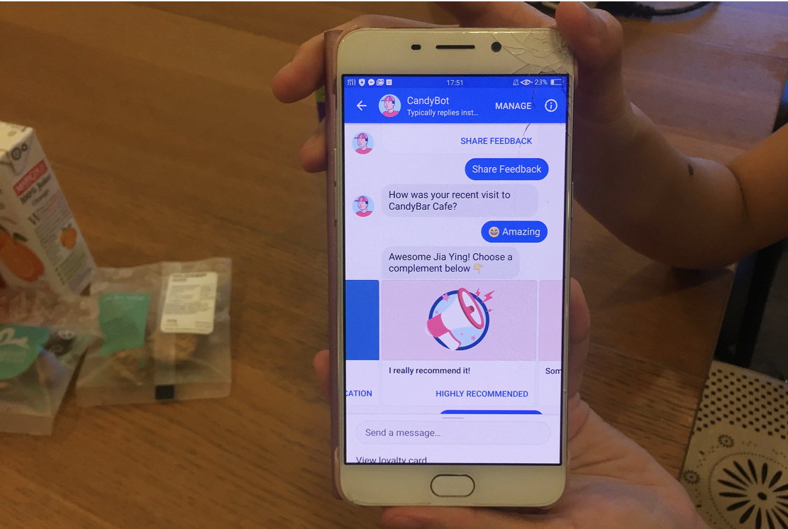
A snapshot of CandyBar Assistant. It tells people how many rewards, stamps and points they have
Why automated conversations?
For us, it all started with an experiment.
We had an SMS being sent out, and we wanted to make it better i.e. more useful, helpful, more engaging and interesting.

Trying to make the SMS shorter, cleaner, with neater links
We did a ton of usability testing on the SMS flow. The results were not great. People didn’t notice the message. It didn’t feel relevant, engaging or interesting.
We had to figure out a better way of messaging people.
Our first MVP experiment with automated messaging was with Facebook Messenger.
Results looked good! Our engagement went up, our testing lead to better results, more people were giving feedback about the places they visited, and conversions looked good too.
So here’s what I learned from the last two years of building automated conversations with my team:
1. Don’t make it look like a human
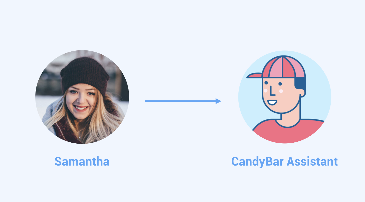
Samantha is not a real person. Her photo is from unsplash.com, a website for free to use commercial photos.
Trust is fragile in an automated conversation.
Make sure your automation clearly looks like a bot. An automation cannot do human tasks.
Be honest and transparent that it’s just a bot and therefore it’s limited. Use non-human names and avatar images.
Our product is both merchant facing and customer facing. So our interface and bots speak to both end consumers and merchants who want to connect with their customers in a meaningful way. We also have an excellent customer support team talking to these folks.
In a complex situation where both people and bots are helping out, clearly differentiating between the two is the key between a good or effective experience and a bad or confusing experience.
2. Design basics are the same, but your tools are different
Stick to a typical iterative product design process.

Your qualitative and quantitative user data is in the center of your process as you ideate and test your ideas in the real world. Make sure you are measuring the right thing. Your success metrics should be chosen carefully.
We did a lot of testing especially for the first MVP automated conversation
But your tools are different
Sketch isn’t the best way to draw your MVP Conversation
Initially I tried to make detailed mockups but my team found it difficult to understand the MVP concept and design updates this way.

Some initial sketch mockups for the MVP
We were iterating too fast (every 2 days) for good looking mockups.
What actually worked:
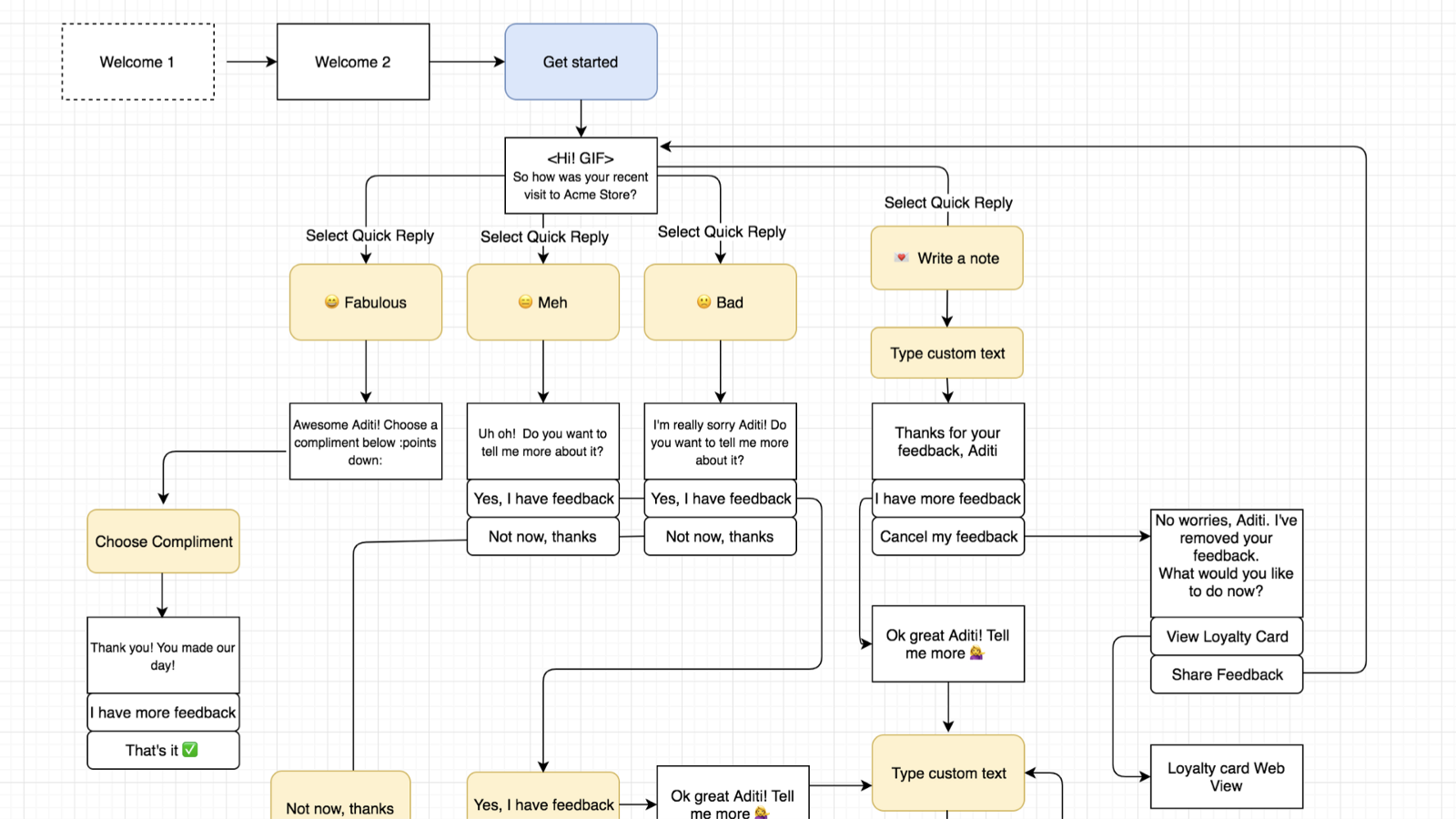
Conversation tree for the MVP
Then, write an MVP script to test each flow
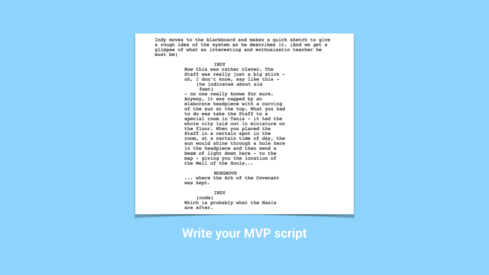
Imagine your MVP conversation like a movie script with characters, stages and scene changes. This will help you test each flow properly, so that it sounds as natural as possible.
Once you have your Conversation tree and MVP script, create some visual story elements:
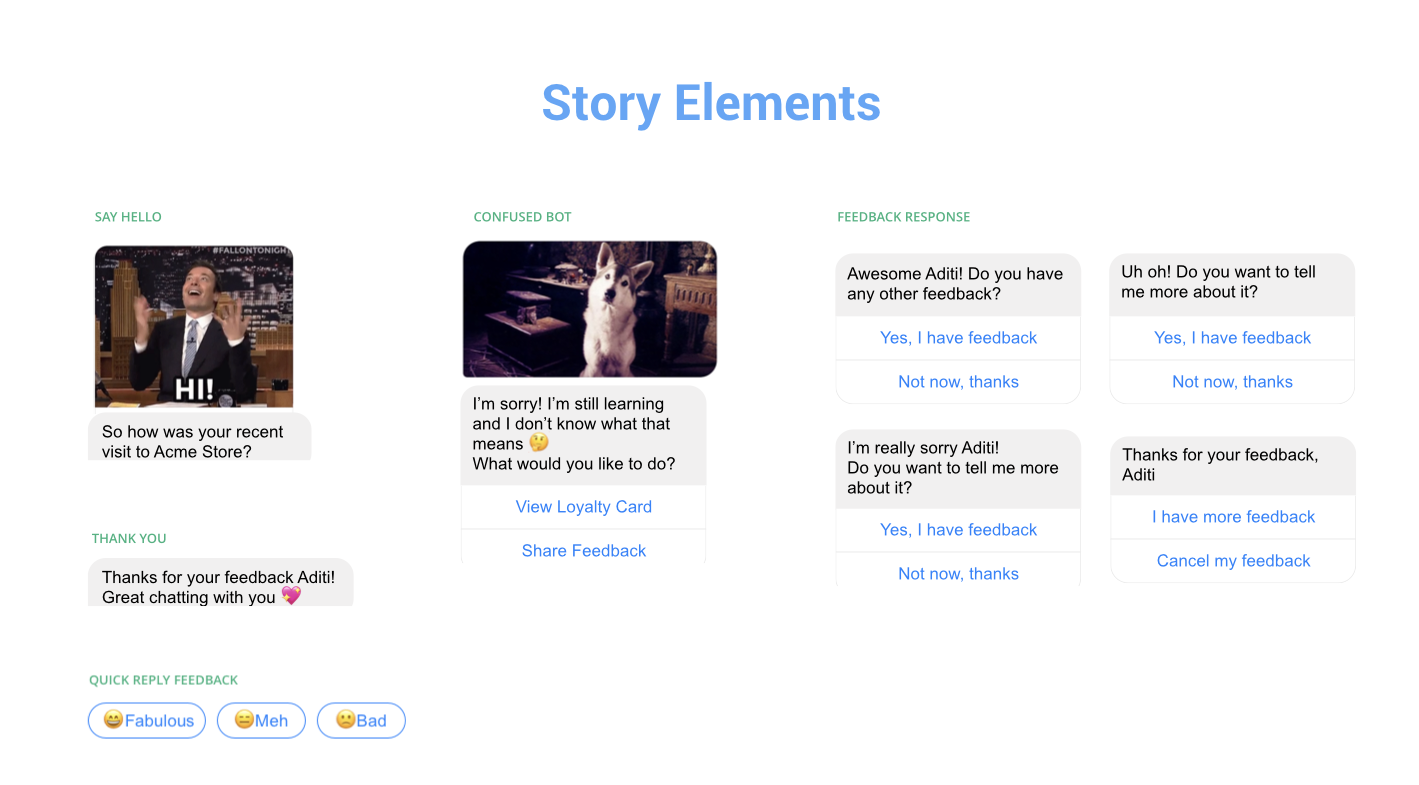
A few story elements from CandyBar Assistant
Prototyping is the best way to share your work
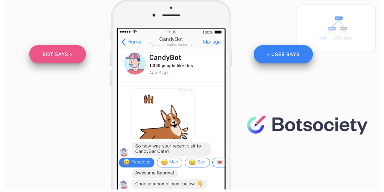
I recommend Botsociety for quick prototyping for your MVP
So in conclusion, basic design process is the same, but the tools you use are different.
3. Become a really good writer OR get a really good writer
Can’t underline this enough. Your MVP has to have good writing. It’s not optional.
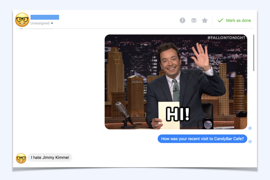
Getting a culture check is good too. Sitting in Singapore, we didn’t know this would happen with Americans using our bot. A surprisingly large number of people hate Jimmy Fallon
4. It’s ok to say sorry and I don’t know
Error handling is always important in any design process, it’s just way trickier in a conversation.
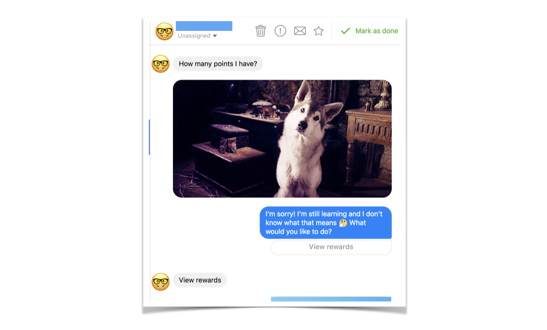
This person asks a pretty relevant question “How many points do I have?” but CandyBar Assistant doesn’t understand. It quickly apologizes, making it clear that it is limited, and provides a button so the person can find their answer anyway. By tapping on “View Rewards” this person can see how many points they have.
5. It’s not AI and it doesn’t have to be AI!
You are replacing a traditional interface of fields and labels with a rich conversation.
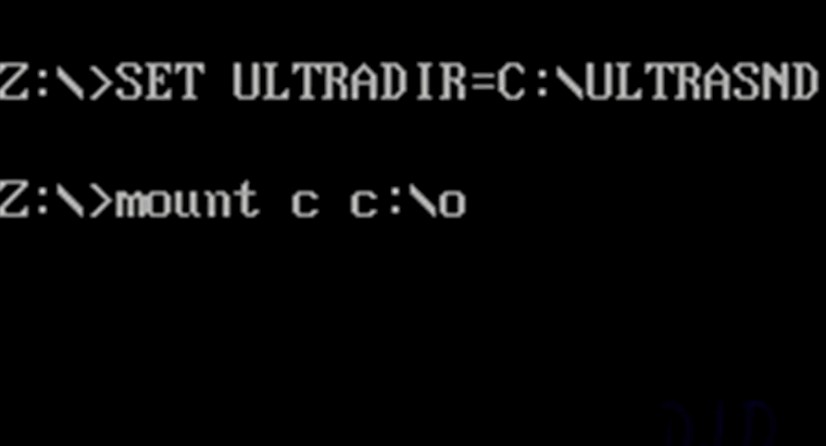
The bot reminds me of this olden days CLI
The bot reminds me a bit of this ancient command line interface I used to load up games when I was a kid. You put in queries, and the system did a thing. If you put in the wrong query, it failed horribly.
With an automated conversation, it’s pretty much the same Q&A format, just in a nicer, more human, friendlier wrapping. Maybe even some jokes, emoji’s and GIFS added to the mix!
You don’t have to have artificial intelligent to create a really really good experience for the people using your software that’s fun, enjoyable and also works.
TLDR:
Don’t make it look like a human.
Trust is fragile in an automated conversation
Design Basics are the same but your tools are different
Write your MVP script and test as much as possible
Get a really really good writer
It’s ok to say sorry and I don’t know
It’s not AI! It doesn’t have to be AI to be effective
Thank you for reading! This article is based on a talk I gave at UXSEA in Singapore, Nov 2018.
I’d love to hear your perspective on this, please add your comments below.

What I learned from listening to 40 product leaders from South East Asia
Networking has become a bad word.
Networking has become a bad word.
It means saying “So what do you do?” repeatedly and superficially at after work meetups while half-listening to a speaker talk about their work.
I’ve faced my share of superficial conversations. As a frequent outsider at these events, I spend at least 3 to 4 mins of a conversation looking at the puzzled face of the person I’m trying to talk to as they try to repeat my foreign-sounding name awkwardly or try to parse my accent.
It doesn’t have to be like that. Meeting people from your industry can be meaningful and conversations can be real.

Arriving in Ubud, Bali for a 3 day retreat with 40+ product people :D
I recently spent 3 days in Bali listening to personal work stories from 40 product leaders, founders and cofounders from Singapore, Indonesia, Malaysia, Australia and HongKong.
This is what I learned:
Everyone is struggling to make their work meaningful
I met Dan and Jo from Hong Kong. They’ve been working on a solid, actionable framework for Making Meaningful Work or MMW for more than 20 years. It was inspiring to hear their story.
After three short sprints we came up with an initial framework of ideas for working with our teams with a lot more heart.
I found several people in the group who hate the term “soft skills” as much as I do. The term soft skills is just a horribly dismissive way of talking about the most important part of leading a team — being human, listening and caring.
The focus was on actionable, positive things to do for your team. And how to develop healthier, sustainable and more meaningful ways of working.
“It doesn’t have to be crazy at work.”
It really doesn’t! We aren’t machines that can be equally productive every day, every week and every year.
You’re not a car that can always “go the extra mile.”
Level 4 listening is hard

Going from factual listening and downloading to deeper empathy and generative listening
We’re continuously distracted by smartphone notifications from our friends, family and work.
I’m frequently tapped on my wrist by my Apple Watch, reminding me to stand if I’ve been sitting too long.
Michael put up this sheet early on during the event, telling us to try and practise Level 4 Listening. With a stranger that’s tough, and in todays tech world, that’s even harder.
As a designer I’m formally trained in empathic listening. But listening and being empathic during a 2 hr usability interview and doing it constantly is a different thing.
Empathy only takes you to Level 3 listening
For example, I listened to a hiring manager talk about how they judged someone for leaving jobs every year or “job hopping.” And later regretted it.
Level 3 listening means you can hear their story with true empathy, leave your self and your judgements out of it, truly feel the other persons anxiety and point of view.
Level 4 listening is more generative. You build on base empathy with a deeper sharing of ideas and feelings. You swap stories. For example, I shared a story of my own personal bias during hiring, and when I realized it. It’s important to avoid jumping directly into solutioning during this level of discussion. Just reflect, share and listen.
I’m not the only one with Creative FOMO
Fear of missing out for creative people
What is creative #fomo? The feeling that out there, there is a better and sexier product and a more genius team that you can work with.
Where you can do better design things in a better way.
I’m always looking for people with good taste. I’m always in a #fomo about doing better and better work.
It was heartening and validating to hear similar self doubt from non-designers. Though it did take some time for people to open up about it.
It’s about people, not processes
After a number of years of experience, all leaders from all fields reach this same conclusion.
People are so important!
I think this tweet sums it up:
Deep, meaningful conversations means you cannot avoid the other persons politics
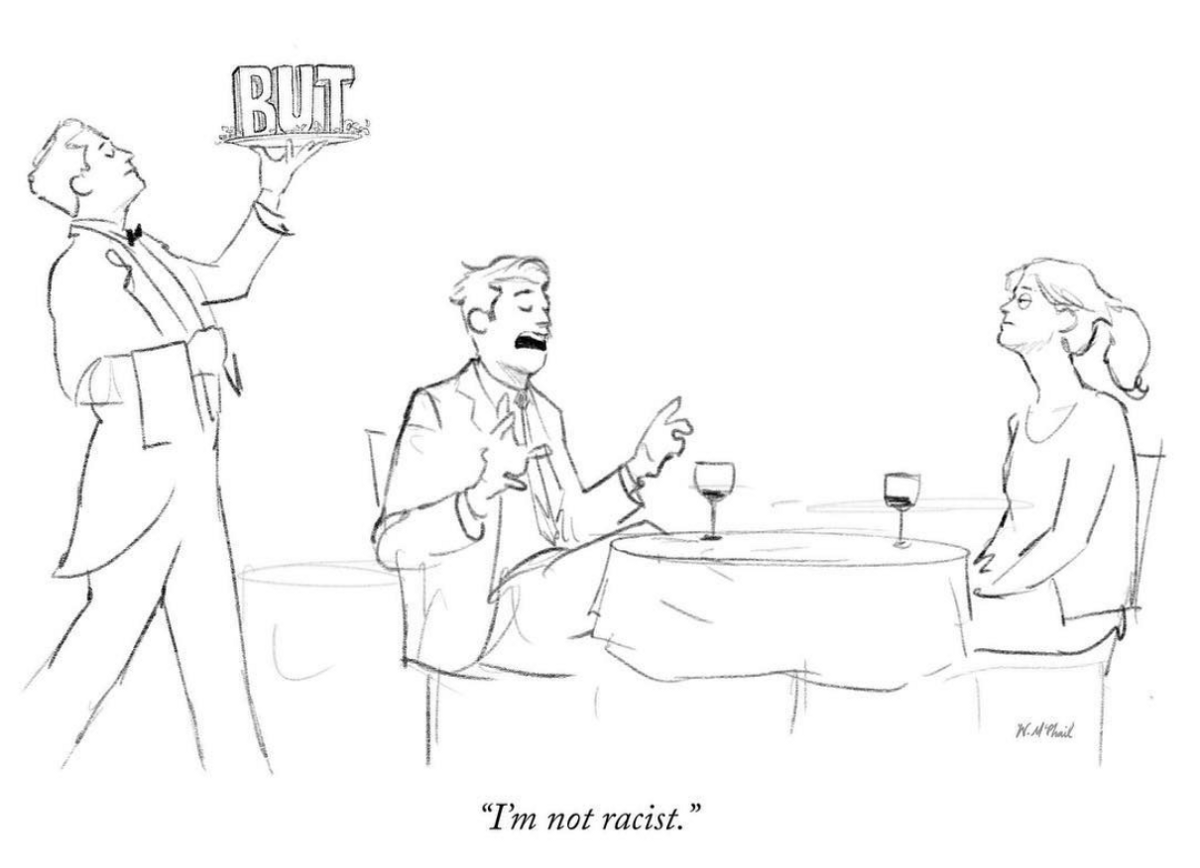
Comic by Will McPhail
Keeping things polite is impossible in a group of 40 people in Bali trying to practise level 4 listening and sharing and spending all their free time together.
It’s okay to have uncomfortable or even hurtful conversations or to be in groups of people where people have sexist or racist beliefs — that’s reality.
Really listening requires suspending your own impulse to correct, to dismiss, to shut down. Navigating this is a challenge, because you don’t want to betray your own values — but you want to give people enough space to open up and feel comfortable having their opinions challenged and scrutinized.
P.S. This is for work. This is putting other people’s feelings ahead of your own, and it’s important to be mindful of why you’re doing that. You are getting useful insights and you have a goal, but it shouldn’t become your default way of operating. That isn’t healthy.
Do by not doing
I learned a bunch of Chinese sayings during the retreat. The one that stands out is Wu wei or 无为 — which loosely translates as “Do by not doing.”
An important part of being a leader is to know when to let things resolve themselves.
Reacting constantly is probably going to make things worse.
A product manager from the retreat shared a personal story on Day 2. A problematic person in another department was making trouble and creating a negative atmosphere in that department, which was affecting his own work, his team and his timelines. Although he tried for weeks to “fix” this, eventually the problematic person left for unrelated reasons.
The problem resolved itself on it’s own.
A startup is like a sinusoidal wave pattern, just get to the next wave

(A fancy way of saying there are ups and downs and thats ok)
Finally, reach out to your community and be open to people reaching out to you
A solid support system is key to thriving in your industry.
How do you reach out? A lot of people just aren’t sure.
We’re consumed by “busy-work” and miss out on real connections around us. It’s easier to just coast through meetups without having a deeper connection and its easier to avoid truly listening to the other person.
If you look around you, its amazing to see so many people willing to reallyhelp you and talk to you.
All you need to do is be open and vulnerable to that connection.
TLDR
Networking can be genuinely and deeply connecting with people
Everyone is struggling to make their work meaningful
Deeply, truly listening is hard
It’s ok to be in uncomfortable or hurtful conversations — that’s reality
Do by not doing or 无为
Reach out and be vulnerable, it is super rewarding!
Thank you for reading! This was originally published in UX Collective on Medium in June 2018, so this is a repost.
P.S. The G&T Product Meetup in Bali was organized by Michael Ong, Mike, and team. Huge thanks to them for having me :D

The Tubelight- How I learned things years after they were taught to me
In the 90s in India we used the word TubeLight as an insult. For someone who is slow or lights up too late. Basically the last person in the room to get the joke :)
In the 90s in India we used the word TubeLight as an insult. For someone who is slow or lights up too late. Basically the last person in the room to get the joke :)
Agencies, studios, startups and consultancies
I started off as a designer in India with a salary of about $450 per month, designing logos and artwork for brands.
That was 10 years ago.
Since then I’ve worked in ad agencies, mom & pop design studios, tech centric startups and consultancies.
I’ve worked in huge teams of 150+ and tiny teams of 2 and 3.
I’ve worked as a graphic designer in print, as an HCI researcher going door to door in India, as a UX designer in San Francisco and Bangalore.
And now I’m working with a product design team in Singapore.
I looked for a common thread in all this design experience.
The TubeLight Moment

What I found was that throughout my design career I learned amazing new things that only truly clicked much later. I either didn’t get it, got it for a moment and then it was gone, struggled to grasp or apply it in any practical way.
And when it did finally click it was usually months or years afterwards.
Let me illustrate this with a few examples.
Draw 200 trees

My first story is from the design school I attended before I became a graphic designer.
Day two of our five year course we were asked to draw two hundred trees.
My immediate response was “What?”
What was the deadline? How do we draw it? Should we use 2B pencils or something else? Is it supposed to be realistic? Or abstract? What course was this part of anyway? What paper should I use? Are we going to get grades for this?
And so we wandered about our beautiful campus with questions and more questions.
I completed the task along with my classmates, wondering what my teacher was upto. At the time I thought he was just testing us, trying to get us to break out of our usual idea of an assignment. We were coming straight out of a rigid education system and he wanted to throw us into another mindset.
Years later my TubeLight came on and I realised there were two main lessons here.
The first was — Explore, explore and explore some more.
Draw 200 trees was a great way to explore the campus for new students. You could explore different styles of drawing. You could do anything really.
The second lesson was — getting comfortable with ambiguity.
Draw 200 trees was a very vague brief. It was up to us to clarify it, come back to the first principles of it and deliberately interpret it as we wanted to.
Design a chair

I was talking to a close friend of mine about this and she remembered her own TubeLight moment from her design education.
They were told to design and build a chair out of corrugated cardboard.
It had to support the weight of a person and behave like a chair.
Like any design student she was super excited about this exercise. She worked on it for a long time with her classmates and eventually came up with something she was happy with.
However what she thought at the time was:
I’m going to be a graphic designer. That was a really fun exercise but I’m probably never going to design a chair. Oh well.
A few years later — she was working on making hygiene kits for underprivileged children in Mumbai. The goal was to encourage basic practices like washing your hands.
She remembered the material corrugated cardboard.
How it was flexible, strong, affordable, and if done right, could look good. Suddenly she could show off her in depth knowledge of the material to her colleagues and her boss. They had found the perfect material for making hygiene kits.
That was her TubeLight moment — When she realised the exercise wasn’t just about designing a chair. It was about understanding materials. Not just understanding cardboard, but understanding the depth of how you could use a material in different ways.
Explore vs. Execute

Another TubeLight moment for me was when one of my first bosses said:
Your first option is probably the best one
In design school we were pushed to try 500 different options until we found the right one. The harsh reality of the design industry was execution.
You had to deliver results — sometimes on the same day.
Explore vs. Execute. So I thought, OK this was the balancing act we have to do as designers.
Then there’s Make and Ship

If you don’t have time for 500 explorations and to truly go in depth, you can make a quick prototype.
You can workshop and build test objects. This isn’t production quality execution. But you can still explore by making things: You can convince clients with a prototype if the explorations aren’t getting through to them.
Then I discovered- Shipping. Ship your product to production.
When I joined the startup world, this is where the whole explore vs. execute conflict really clicked for me.
While working at Postman, an API testing service for developers, we grew to more than 4 million developers. That means, 4 million developers were using our software in about a year and a half. That’s a really hectic growth curve.
I learned to ship a lot! We shipped to millions of users and learned which designs were actually working, live in the real world.
The moment we knew which designs weren’t working, we would update again to millions of people and keep iterating on the fly.
It was a great way to explore and execute at the same time.
TubeLight moments are not always aha! moments.
They are (sometimes) slow dawning realisations over months and years as you delve deeper into the things you’ve learned.
Learning moments depend on being in the right place at the right time.And having the precious opportunity to practise what you have learned.
Learning design like a TubeLight
1. Most of the time you don’t truly connect the dots until much later.
2. TubeLight moments click like aha! moments.
3. Sometimes TubeLight moments are (painfully) slow dawning realisations.
4. Without the right opportunity in the industry you may never truly learn — because you can’t apply what you’ve learned.
Thank you for reading ❤
I would love to hear your TubeLight moments in the comments :)
(This article is an excerpt from my talk at the IXDA Education Summit in France in Feb 2018).
Originally published on Medium.

Your design career doesn't have to make sense right now
A lot of designers I meet worry about structuring their career in the “right way”. They obsess over which “industry vertical” to work in. They worry if this or that company is the right “next step”.

A lot of designers I meet worry about structuring their career in the “right way”. They obsess over which “industry vertical” to work in. They worry if this or that company is the right “next step”.
This was especially highlighted when I spoke at DBA Singapore recently about my work. It made me realize a lot of things that I’ve learned, I have learned in hindsight.
So here are some things I wish someone had told me while I was slogging out there in the design industry.
Don’t worry about some kind of overarching “narrative” in your career
It will make sense eventually (trust me).
Do what you love, learn new skills (even if they are not design related) and work with amazing people.
If you studied graphic design, don’t get too invested in the label of “graphic designer”.
Your career is not a straight up ladder (it’s a zigzag)

It’s a lot of detours, experiments, random events and luck!
Just have fun on the ride while you try to pay your rent.
If you need to learn a new skill, take that demotion if you can. That new and different skill is going to be invaluable to you in the future.
Failure is good

It makes you question and experiment more. It makes you leave your job and try something else. That’s amazing.
The more things you try the closer you are to finding the thing that is going to work for you and bring the story together (finally).
It doesn’t matter how cool the work is
You could be working for the biggest brands, the coolest clients, newest tech, the most funded startup. But it means nothing if the people suck. Work with the best people and teams. You will become a better designer.
Caring too much about the “what” you are working on is a rookie mistake.
It’s ok to quit your job in the first 3–4 months

No it doesn’t “look bad.” You tried something and it didn’t work. It’s ok!
The best time to quit a job that’s not working for you is in the first 6 months. Don’t stay and just make it worse for yourself and the team you are working with.
Go look for something better for yourself.
Thank you for reading!
What did you learn from your design career? Does your design career make sense? Let me know in the comments :)
This post was originally published on Bytes of Candy in October 2017.

Sequoia::Hack 2016
Super exciting to be part of the hackathon as a judge and mentor for the second year in a row. More than 5500 people applied this year to participate, and it was an amazing turnout. Inspiring to see so many teams come together to build something awesome in 24 hrs. And it is always a learning experience mentoring teams as they develop an idea into realization in a frantic rush to the finish line.
Super exciting to be part of the hackathon as a judge and mentor for the second year in a row. More than 5500 people applied this year to participate, and it was an amazing turnout. Inspiring to see so many teams come together to build something awesome in 24 hrs. And it is always a learning experience mentoring teams as they develop an idea into realization in a frantic rush to the finish line.
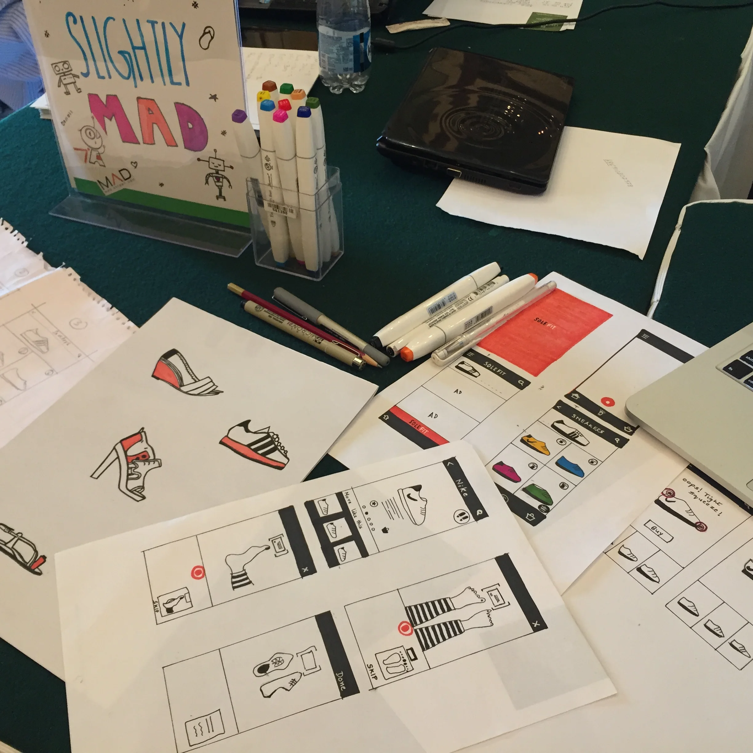
The "Slightly Mad" team talks to me about their foot scanner concept. Loved their design process and teamwork!

See this Instagram photo by @uxartist * 20 likes

By Day #2 everyone was sleep deprived, intense and focussed and the space started to reflect it :)
Only an hour left until judging begins...
It was a bit disappointing to see an all-male judging panel for the main development track in Seq Hack, but hopefully things will improve next year.
The day after the hackathon, there was terrible violence due to the Cauvery river water conflict. It was sad to see this especially just one day after the hackathon where so many futuristic concepts were shared, discussed and built. While a team in the hackathon won for building a robot that can help diagnose your illness, the streets the next day fought over water shortage, communal differences and drought issues.

Flowers & People
A young family enjoys the digital installation 'Flowers and People cannot be controlled but Live Together' by teamLab, a group of Japanese artists.

A young family enjoys the immersive digital installation 'Flowers and People cannot be controlled but Live Together.' It was part of the 'Art in Motion' series during Singapore art week. I noticed more than 8 massive projectors used to create the space. The flowers and petals grow, wither and die. As you move, the petals try to grow around you along with a tinkling almost fairy-like sound. Overall a beautiful, almost meditative experience.

Creating the Jugaad Dishwasher, The X-Way
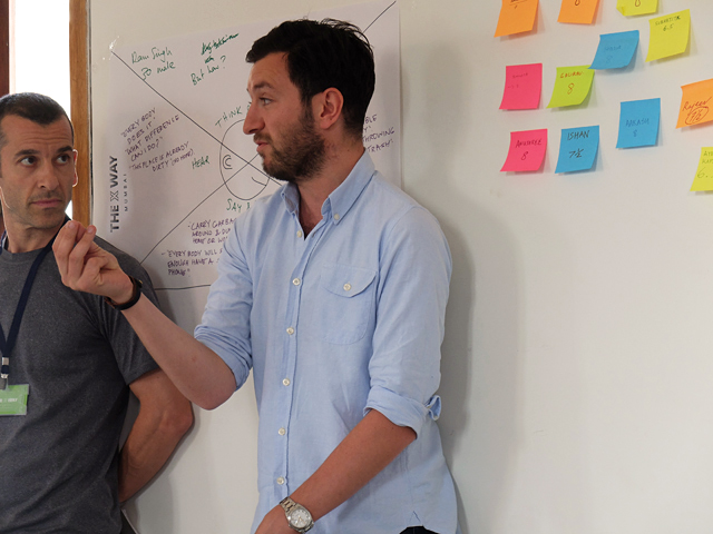
The X-Way was a 2 day workshop sponsored by Nokia and Microsoft that focused on ideas, strategies and discussion around improving Mumbai city. Ben & Andrew moderated the workshop, keeping it challenging as twenty creatives and innovators came together with many, many city ideas.
The X-Way was a 2 day workshop sponsored by Nokia and Microsoft that focused on ideas, strategies and discussion around improving Mumbai city. Ben & Andrew moderated the workshop, keeping it challenging as twenty creatives and innovators came together with many, many city ideas.
One of the interesting exercises was listing things we love and hate about Mumbai. It was heartening to see that the 'love' pile was so much bigger despite Mumbai's numerous faults.
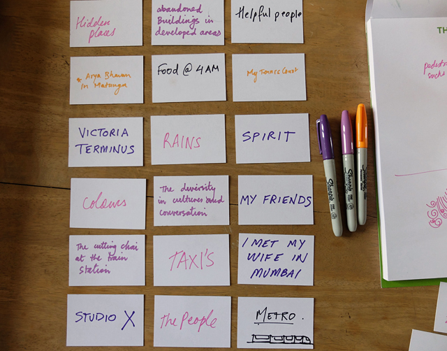
When discussing Mumbai's numerous problems, traffic cannot be ignored. Everything to do with traffic and way-finding is contextual. Signage is missing in a lot of places. When pedestrians give directions, the meaning may be different depending on the tone of their voice, how they stand, hand gestures and language. Honking has varied meanings depending on frequency, tones, loudness and the length of each honk. The city is a hotbed of large scale issues and topics of interest.
My team eventually looked at pavement ownership as a microcosm of health and sanitation. How could we encourage and create value in a public space such as pavement. We were in posh areas of Mumbai, and even here we found street hawkers taking ownership of pavements (in a good way) keeping them clean and ensuring their part of the pavement was maintained. Eventually we focussed even further and came up to a sugarcane vendor. Could we come up with something to help him wash the glasses in his stall while he was busy doing a million other things like making the juice, serving and cashing. A lot of times hygiene and proper washing was way down in his priorities while multi-tasking.
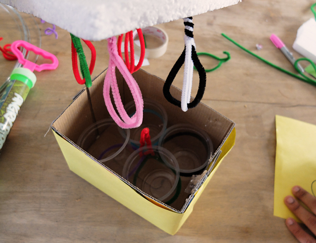
The final concept after two days of guerrilla research and quick prototyping was the 'jugaad dishwasher' - a mechanically automated machine that washed glasses saving the vendor time and effort as he ran a one-man operation. The washer connects to the juice machine itself so it doesn't need electricity to run. Soap is optional here since most vendors do not use soap. Overall the 'jugaad dishwasher' concept could also work for other street hawkers, juice vendors and with a few upgrades could even save time in someone's kitchen.
Check out some photos of the prototype we made. The video below has a few shots of us talking to sugarcane vendors.

The rotating juicer translates into the up and down movement of the simple washer, which repeatedly rinses the glasses. The trough can be easily refilled and cleaned and occupies minimal space.


Arduino Yun Workshop
The two day workshop by Ankit Daftery was a great way to dig deep into the possibilities of the Yun. As an interactive artist, I'm already aware of various options available. Trying them out was empowering and surprising. You can make complex interactions with just two to three days of effort [as a beginner], especially at an affordable price.

The two day workshop by Ankit Daftery was a great way to dig deep into the possibilities of the Yun. As an interactive artist, I'm already aware of various options available. Trying them out was empowering and surprising. You can make complex interactions with just two to three days of effort [as a beginner], especially at an affordable price.
This example converts two fruits into a drum kit, sort of a very basic version of the famous Makey Makey. Below is a short video of the test.

UX Workshop at Construkt
The workshop focussed on teaching hands-on design prototyping, taking the participants step-by-step through a prototyping process, how to think and analyse their design concept, and even a quick ten minute guerrilla user research at the festival grounds.

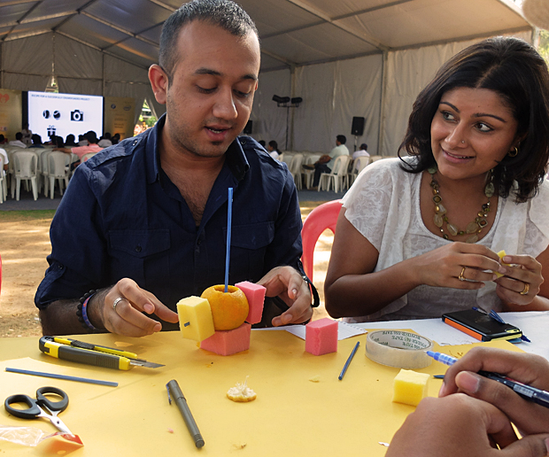
The workshop focussed on teaching hands-on design prototyping, taking the participants step-by-step through a prototyping process, how to think and analyse their design concept, and even a quick ten minute guerrilla user research activity at the festival grounds. It was rewarding to see the 25 participants get so involved and excited about what they were building. Below are some pictures of the three hour session. It started with some warm-up creative thinking activities, after which the participants chose a random 'everyday-life' object. They then proceeded to redesign it, much to their surprise! One of the participants chose an orange as a common 'everyday' object for the first exercise and ended up 'redesigning' it into a scent dispenser and pen holder. Every participant had a set of raw materials such as card paper, straws, tape and foam pieces to use. UX Workshop participants at the Construkt Festival, Bangalore. The Construkt team gave me a beautiful location under a giant tree on the festival grounds, so everyone could work in the outdoors.

UX participant shows off his prototype, a redesigned Table Tennis racket as part of a completely new type of Table Tennis.
UX workshop participants at the Construkt festival, Bangalore. One of the central goals of my workshop was to make it hands-on learning, and also ensuring it was fun. It is so important to enjoy these exercises since it makes people more relaxed and therefore more creative.
UX participant shows off his smart watch prototype at the end of the workshop. The last stage included quick user research, getting reactions from people wandering around the festival and trying to make last minute adjustments on the first level prototype.

Installation Sketches
Worked on some collaborative concepts with Ankit Shekhawat who is the head of the Emerging Media lab at Moonraft in Bangalore. We pitched these ideas to an upcoming event in Bangalore. Conceptualizing these installations is a really fun process, especially when budget is not a constraint. Quite proud of these ideas, since we went crazy dreaming up robot drones to do our bidding.

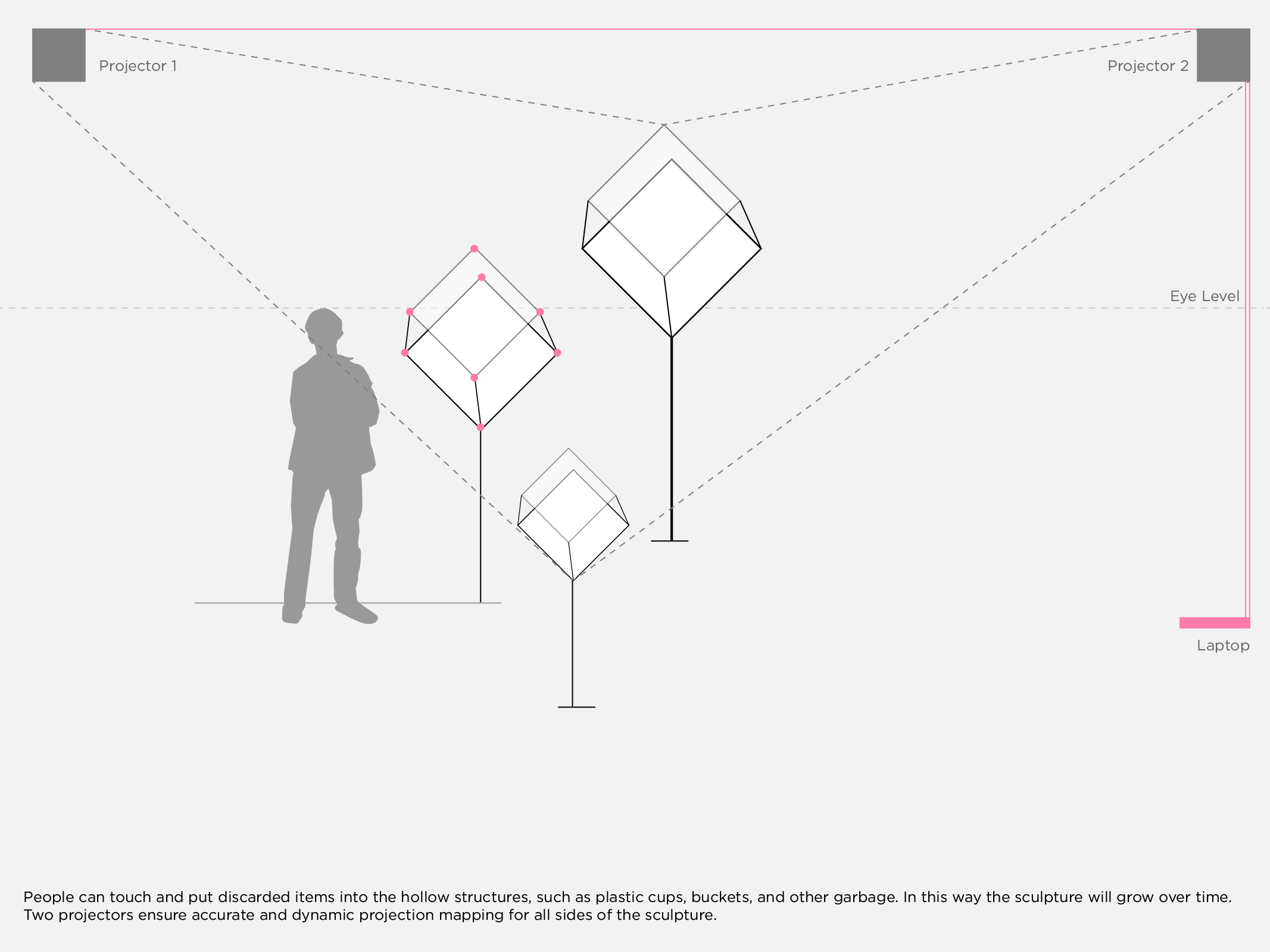
Worked on some collaborative concepts with Ankit Shekhawat who is the head of the Emerging Media lab at Moonraft in Bangalore. We pitched these ideas to an upcoming event in Bangalore. Conceptualizing these installations is a really fun process, especially when budget is not a constraint. Quite proud of these sketches, since we went crazy dreaming up robot drones to do our bidding.
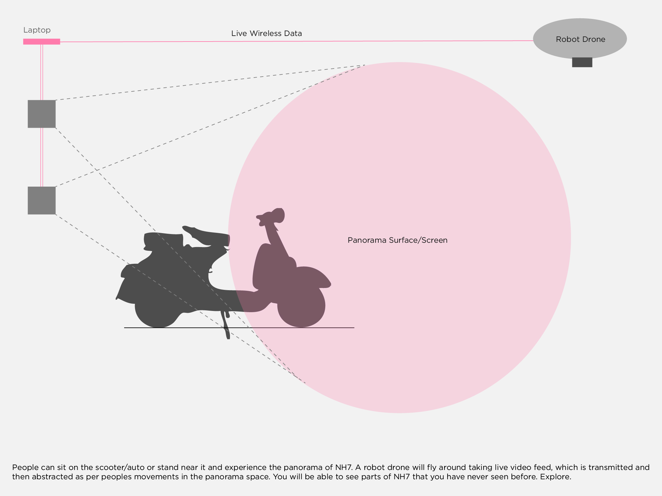
Hoping to get a chance [funding] to build this stuff one day.

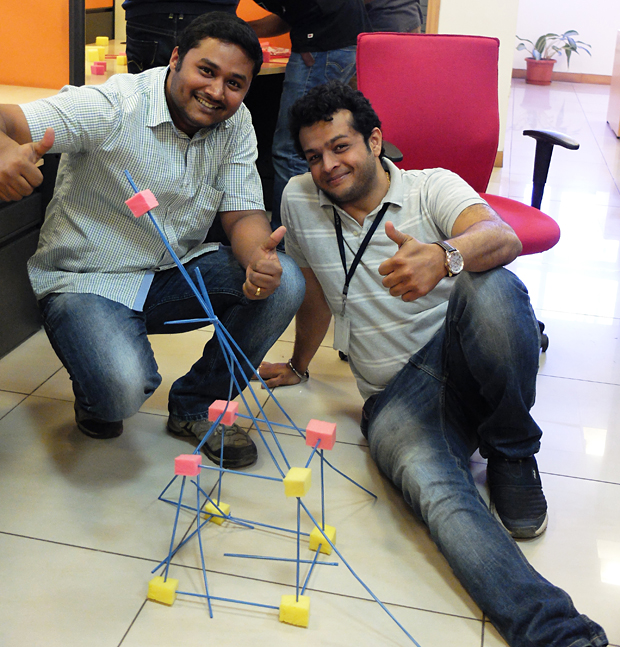
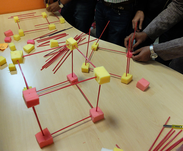
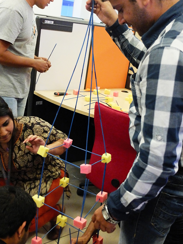
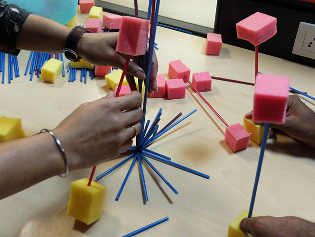
Creative Workshop at Sourcebits
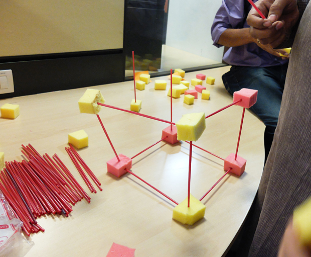
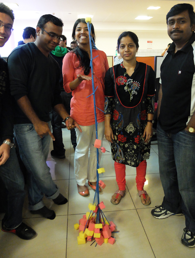
nspired by the Marshmallow Challenge Ben and I organized a creative thinking workshop for the lively crowd at Sourcefest, a two-day hackathon for the employees of Sourcebits. The aim of the session was to get people excited and energetic, and of course get their creative juices flowing. Instead of using marshmallows and spaghetti, I sourced waste foam material and straws. The idea of wasting so much food just didn't make sense [especially in India]. 45 people attended the session.
Inspired by the Marshmallow Challenge Ben and I organized a creative thinking workshop for the lively crowd at Sourcefest, a two-day hackathon for the employees of Sourcebits. The aim of the session was to get people excited and energetic, and of course get their creative juices flowing. Instead of using marshmallows and spaghetti, I sourced waste foam material and straws. The idea of wasting so much food just didn't make sense [especially in India]. 45 people attended the session. Rules were pretty simple, use only straws and foam cubes, no glue/sticky tape is allowed, and the tallest structure wins. And the tricky part - the tallest point of the standing structure has to be a piece of foam.
Very rewarding to see everyone have so much fun and make crazy structures. Here are some pictures from one hour session.


Vikhroli Skin - Prep
My most recent work will be displayed at this event sponsored by Godrej Labs on the 14th of Dec. It is going to be 200 thousand square feet of art, performances and culture, so don't miss out if you are in Mumbai.
My most recent work will be displayed at this event sponsored by Godrej Labs on the 14th of Dec. It is going to be 200 thousand square feet of art, performances and culture, so don't miss out if you are in Mumbai. The space is an abandoned Godrej factory which will be demolished soon after the art event. The factory will be moved elsewhere. It is deeply relevant to the story of Mumbai and how it has grown into post-industrialization. Here are some images of the space, once the setup starts I will do my best to share photographs of the buildup.
The plan is create an interactive installation using projections, the audience and city images. It is going to be a real challenge setting up an installation outdoors, in the day time, where electricity is coming in from generators. Limited electricity means that planning and testing the installation in another location is crucial.


NID Talk
NID Talk Mobile UX - What it's like to design and create iOS and Android apps today.

It was a healthy turnout of about 45 students, still in their first years studying Interaction Design. Talking about my work from the past six years helped me look at it in a completely different perspective, basically the breadth of different types of projects I've done, and what interested me the most. It was titled 'Mobile UX - What it's like to design and create iOS and Android apps today.'
Students were full of questions, which is a great sign. Post talk discussions brought up several interesting topics, such as power dynamics between designers and engineers in the industry today. One thing I always stress is respect - engineers are the ones implementing your work so a healthy respect goes a long way especially in large companies and situations when engineers are part of a client team. Another thing that interaction designers should strive towards, and something I struggle with everyday, is keeping up to date with the latest tech so you can converse intelligently with the team.

One of the stories I like to tell at such talks. Check out the full article here.

NID Bangalore is a R&D hub for design in India. Image Source.

The Clock
Almost calming, at times ironic and humorous this 24 hour video work pulls you in and makes you just sit and watch for a while. I managed to watch it for 30 mins the first time and 2 hrs the second time. Almost addictive and hypnotic it's amazing how accurate the film is and lovely to spot familiar scenes from favorite movies or old classics I was forced to watch in art school.
While first entering this work by Christian Marclay, I was a bit sceptical due to the expensive MoMA entry fee of $18 and then the huge 45 minute queue to watch the video. Eventually I got in and it was worth the effort. Almost calming, at times ironic and humorous this 24 hour video work pulls you in and makes you just sit and watch for a while. I managed to watch it for 30 mins the first time and 2 hrs the second time. Almost addictive and hypnotic it's amazing how accurate the film is and lovely to spot familiar scenes from favorite movies or old classics I was forced to watch in art school.
A must-watch for anyone interested in the video art side of things. Ever since I accepted the fact that I cannot enjoy art at a purely intellectual level it is much easier for me to spot things that I like versus things I don't like. It's almost crude to divide art into these groups but it is true. You either feel something when you look at a work or you just don't feel it. You can still enjoy the techniques/concept/history/context/etc. that the artist uses but eventually it doesn't matter. If you really want to become an art lover, then be honest and admit that the giant 100 yr old oil painting of a naked woman is pretty cool but doesn't do anything for you.

The Clock 2010 by Christian Marclay. Single-channel video with stereo sound. Twenty-four hours. Image Source.

Ramkinkar Baij
However it was enlightening to see his growth as a brilliant artist and the extent to which his personal philosophies, politics and ideas were so deeply and honestly entrenched in his work and life. Baij clearly 'lived' his ideals, spending a lot of time with the Santhals who were a prominent topic within his work.

I recently visited NGMA, where they had an exhaustive collection of this artist's work. At first I was skeptical about what was clearly a collection of work from a long ago era of Indian art. Personally, I favor viewing more radical or contemporary works. However it was enlightening to see his growth as a brilliant artist and the extent to which his personal philosophies, politics and ideas were so deeply and honestly entrenched in his work and life. Baij clearly 'lived' his ideals, spending a lot of time with the Santhals who were a prominent topic within his work. His abstract sculptures were a pleasure and my favorites amongst his life's work. His sculptures of animals were brilliant and at times even humorous.

Dog by Ramkinkar Baij, Terracotta, 1950's. 38.5 by 29.5 by 22cm. Image Source: Delhi Art Gallery.

The Poet by Ramkinkar Baij. 1938. Image Source.
Other works worth noting are The Harvest 1957 (oil on canvas), Atomika 1969 (oil on canvas), and a sculpture portrait of Pramod Ganguly (Plaster of Paris).

Gallery Reflexive
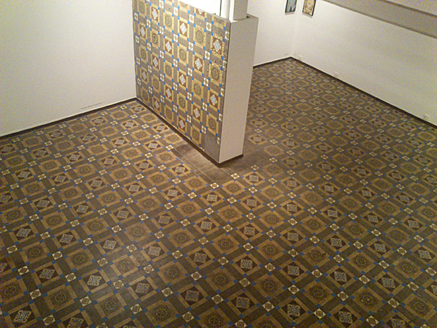
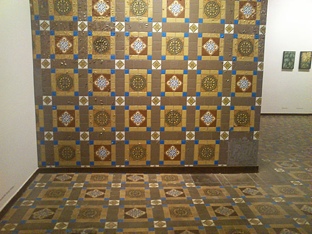
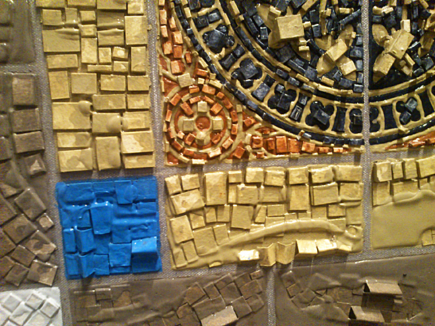
Work by Prajakta Palav. It caught my eye because of the way she had used the gallery floor in her work. It is intelligent and relevant, especially in these old buildings in South Mumbai that are converted into gallery spaces.
Prajakta Palav (Dec, 2011). This caught my eye because of the way she has used the gallery floor in her work. It is intelligent and relevant, especially in these old buildings of South Mumbai that are converted into gallery spaces. What I love about this is how the work is almost indistinguishable from the gallery floor at first glance. It makes you sit up and pay attention. Here are some pictures I managed to take from my mobile phone.