UX principles - Is it all just fluff
I used to think that UX principles were a bunch of fluff without any substance. I was Startup Aditi on a metaphorical rocketship. Let’s just go faster! I thought. I had already helped build successful products and businesses over a 15 year career in product design. For e.g. I’ve worked with high growth, successful SaaS companies like Calendly and Postman before they became successful and famous.
And what I’ve seen is that it goes really, really fast with small lean teams of 20 people who know what they are doing. These products that we built are being used by millions and doing really well today without writing any fluffy principles. So yeah why do we need UX principles anyway?
4 yrs ago my perspective changed and I started to learn about UX principles.
So today I want to share some practical stories and examples on how UX principles can help you in your day to day life as a designer or product person. This is a long form visual essay so you can jump to a section or scroll the entire thing whatever works.
Jump to:
One of the things I used to think as a design leader- why try to get the principles right when you can just ship, ship, ship and learn from reality about whether the product worked in the real life market.
The reason I was skeptical. Is that whenever I had encountered principles before, there were usually hung up on office walls and posters and didn’t really influence how we worked on the real product or our process. These cool sounding principles were in our presentation decks to investors but not used in projects.
There were really nice and inspiring, but they weren’t really useful when it comes to real outcomes
What is a UX Principle
A lot of my initial skepticism started from a misunderstanding of what a UX principle was. Values and principles are often spoken of in the same breath so let’s first understand the difference between these two things.
Values are qualities or standards of behaviour. They help us form principles. Principles are rules or beliefs that govern our behaviour and they are based on values.
Values are more subjective and spark conversation. Principles are more strict, like rules or guard rails.
For e.g. Honesty is a value. A strict principle based on honesty is “Don’t ever lie, not even to prevent harm.”
Examples of company values and principles
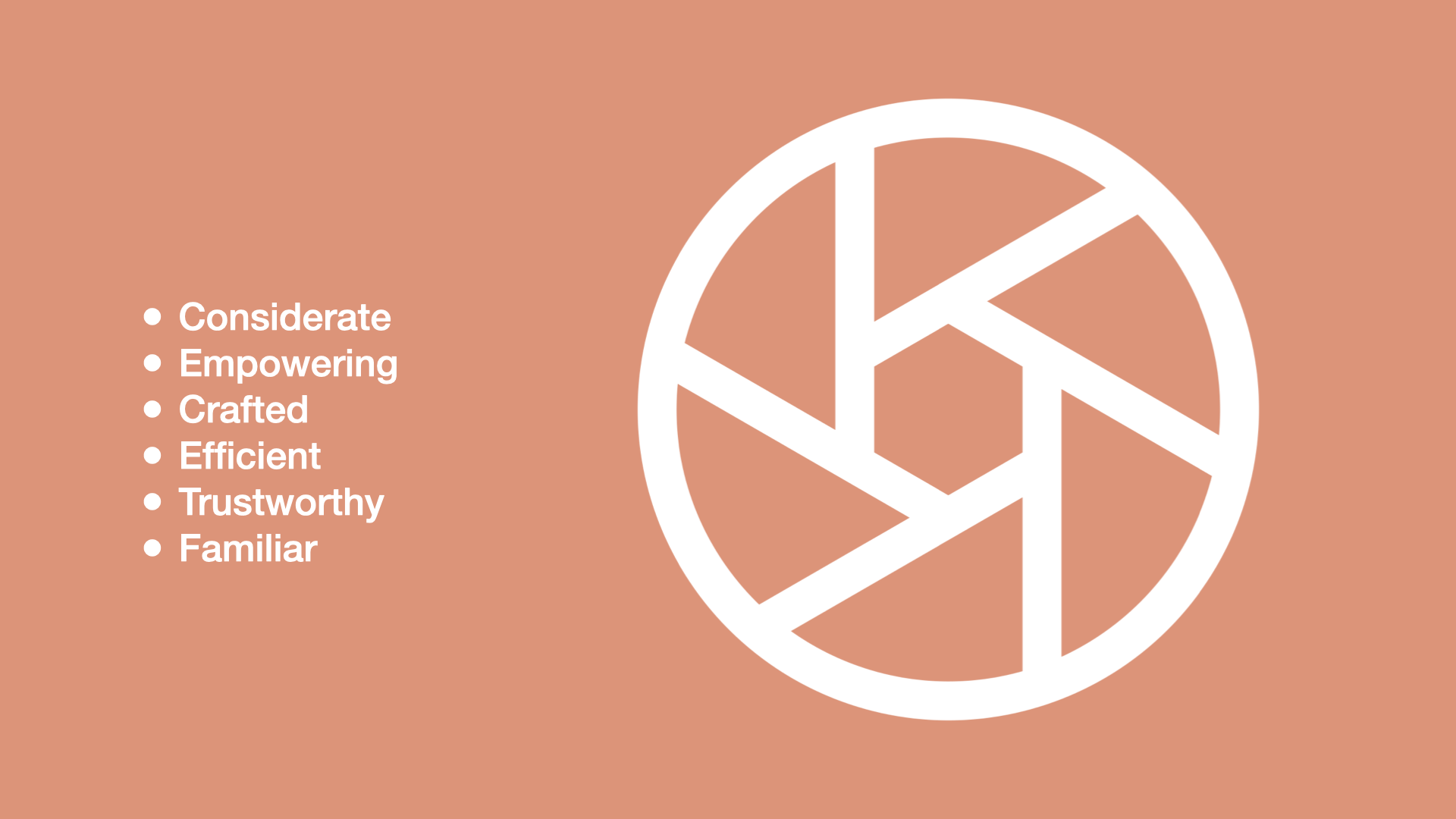
Another example of values are these UX values from Shopify, which you can find on the Shopify Polaris design system website. The values are: considerate, empowering, crafted, efficient, trustworthy and familiar. These values are subjective and spark conversation. They are a lens through which the UX team at Shopify can critique and discuss their work.
My diagram is based on an illustration from here
So you can have these personal values and principles at an individual level and then you can have product values and principles which help guide a team or an organisation or a company like Google or Apple towards a specific direction.
The principles we are talking about today are the values and principles around how to build product and design things. We are not talking about your personal values & principles here.
Don’t make me think! This is an example of a product principle from Slack. They have crafted 5 principles based on their product philosophy as an organisation and this is one of them. It’s an important rule that guides how their product organisation makes things
So the 5 principles or rules are distilled down to:
Don’t make me think
Be a great host
Prototype the path
Don’t reinvent the wheel
Make bigger, bolder bets
Having just 5 concise rules makes it very clear what Slack’s product org values and how they think about software design and development. The fact that these are the 5 principles and not any others tells us a lot about what this organisation values and how they want to function when they are designing software.
Another example is this design principle from Apple for iOS. Direct manipulation of onscreen content through gestures, people can see immediate, visible results of their actions.
Facebook had a principle to move fast and break things. Eventually they changed it as the company changed and that’s okay too.
I really like this set of design principles by Intercom:
Connected modular systems
Opinionated by default, flexible under the hood
Follow fundamentals
Make it feel personal
What you ship is what matters
My favorite one is - Opinionated by default, flexible under the hood. What this means is that they optimize their designs to feel simple and opinionated by default, but progressively reveal power and flexibility.
So this is the full picture I’m painting here. We have values, on top of which guiding principles are created. Decisions in a team or an organisation are made based on this foundation.
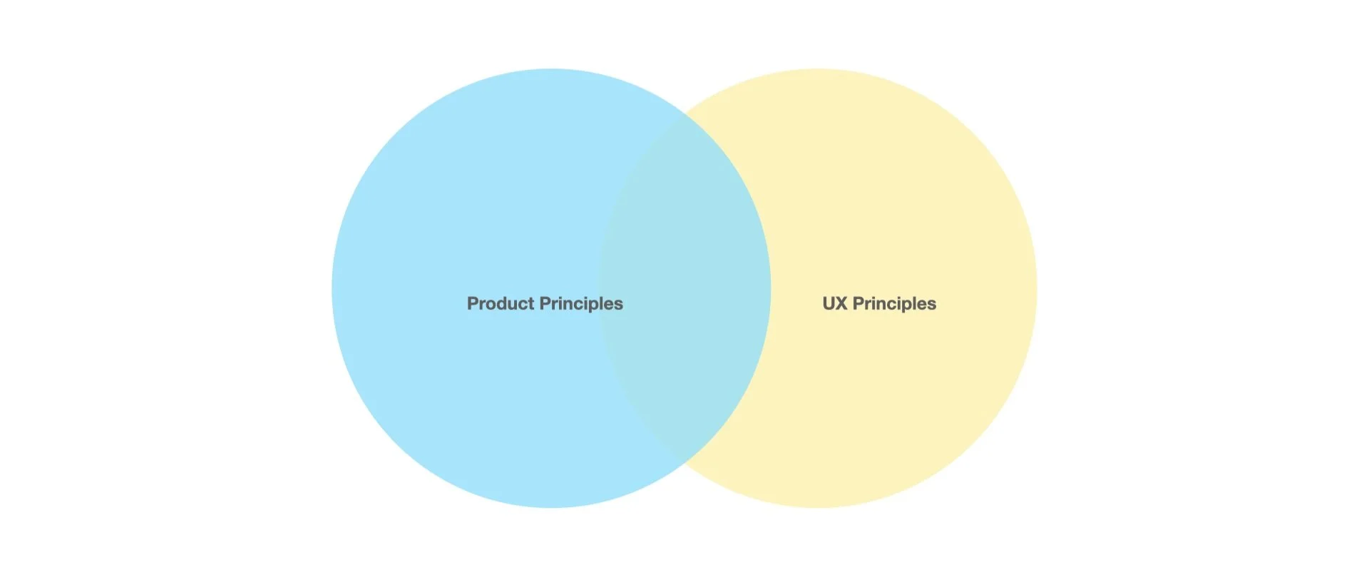
Principles can be product principles, UX principles or both.
Don’t forget, the way I’m talking about it here is that everyone works on the product. It doesn’t matter if you are a designer, data person, product person or engineer - every person is working on it in some way or the other.
So principles are super foundational.
Difference between product principles and UX principles
What about the difference between product principles and UX principles? One way to see it is that product principles apply to everything in software development but UX principles are more specific to our craft as designers.
Both are foundational principles and guard-rails, they just look a little different.
So to summarize,
A UX principle is a guiding rule or a guard rail based on an organisations values.
A value is more subjective like “Simplicity” and a principle is a more specific, stricter rule based on that value like “Short beats good.”
A principle is foundational - it can be either a product principle or a UX principle or both.
It can be a foundational tool for your design approach - its not all fluff, at least that’s what I’m trying to convince you of :D
What I’m trying to convince you of is that a UX principle is a tool. It’s one of the many tools in your skill set as a designer. It’s not just a bunch of fluff :D
6 signs you need UX principles on your project or team
Lengthy, repetitive debates and,
Passionate, spicy topics and themes
A common situation is that there are lengthy debates about design decisions in your team, which often repeat themselves in topic and theme. Maybe even some spicy debates, topics people are really passionate about like data privacy.
Okay time for a story and a detail project level UX principle example.
My team was designing a modal that helped Shopify merchants choose their data preferences when they installed an app. This was a tough challenge because of the natural tension between privacy concerns and the merchants need to share data for various features to work properly. The choices they would make would impact how their app functioned and would impact their bottomline, sales and GMV.
How do we communicate to the merchant so they can make the best decisions, without bombarding them with too much technical information?
So my team came up with this principle which is - data sharing is a preference, not a technology choice.
Let merchants choose their comfort level, rather than a specific technology. This helps merchants make an informed choice, without having to understand technical jargon. It also future-proofs their choices, and lets us add new technologies that match their preferences
This is a product principle and a UX principle.
It has helped us make so many design decisions since then and continues to be useful today. We have also shared it with our partners to help them understand why we don’t want to say “server side apis” in all our content design materials
3. Complex, large org structures
Multiple teams with multiple layers working together need to communicate their specialised knowledge and decision making patterns. For e.g. we understand intercom or Slack a bit more now that we know how they approach their decision making for their product. That’s an entire org of 100s of ppl that we know a little bit more now
4. Fast growing team
Another sign you need UX principles is - your team or org is growing super fast. New ppl are like what’s going on.
Remember Startup Aditi? I didn’t need UX principles because we were working in small lean teams of 20 people. We were working closely with founders all sitting in the same room. Everyone implicitly understood our goals and absorbed ways of decision making. The moment you scale into huger orgs though, you have to communicate this stuff somehow.
5. Remote work and normal working hours
Tbh. I didn’t need UX principles because I was working 16-18 hrs a day in the office LOL. When we are working remotely and healthy work hours we need other ways to communicate our decision making patterns. Instead of just getting on a call every time a discussion needs to be had.
In a more mature team you want to be able to communicate decision making patterns async instead of “jumping on a call” and interrupting everyones work every time a tough decision needs to be made :D
6. Product team or RnD team
Another sign that you may need UX principles is that you are a product or RnD team.
A product team or an RnD team needs principles. If you are an execution focussed feature team, you don’t need principles that bad because decisions have mostly been made already. So principles are important for teams that are driving their own ship and choosing their own path.
So to summarise, you probably need UX principles if:
You’re having lengthy repetitive debates
Passionate, spicy hot topics keep popping up
You’re a fast growing team and new people want to contribute quicker
You’re in a remote work situation
Or even if you’re in a complex large team structure, cross company collab
Again, principles are important if you’re a product team, not if you’re a feature team
How UX Principles help you and your org
Design principles helps us make decisions, and reflect how we process information and how we communicate. Instead of focusing on the technique and process of design, we want to focus on design principles here.
A good UX principle is not open to interpretation. It’s specific, concise and contextual. This provides helpful guard rails for the team. People need this guidance, they don’t need another debate.
A UX principle can be emotional and inspiring. So it helps the team connect with goals, values and decision making patterns in a meaningful way.
If the principle is high level, it may also help the design team connect with the company’s brand story.
This is the famous owl meme. As creatives a lot of times we are asked to draw an owl in this way. We may have some initial direction of draw 2 circles. Then all the other steps have to be filled in by us. Good UX principles are tools to help you and your team along the way :D
A UX principle communicates how your team thinks so it can help with alignment across complex org structures. For e.g. when it came to this principle around data sharing as a preference, it helped us align with multiple teams and functions including our external partners outside Shopify.
When using these principles with partners, it’s not always smooth going. However it helps spark an important debate and conversation that helped us either strengthen our principles or come up with alternative tactics to work with other teams.
Reframing: Exposing our project principles to other teams and companies helped us reframe the principles and improve on them faster whenever needed.
In many ways this underlines the philosophy that design should start with words.
Before jumping into the UI we should think about how we want to approach the work and articulate it and get alignment.
How to write UX principles
Tips on writing UX principles and improving your current principles
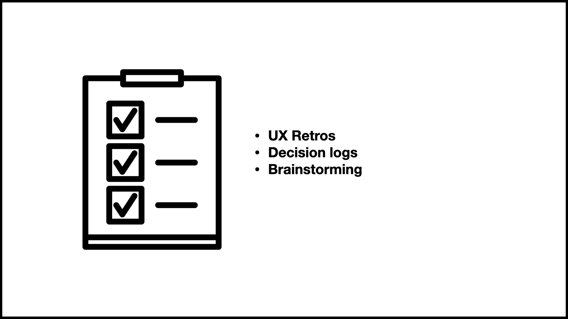
1) Investigate your decision log and run UX retros
First write down all the tough decisions your team has made recently. Most teams have a decision log you can refer to. Identify all the decisions that didn’t immediately come from existing principles and missions you have articulated already. This is where your principles will come from.
Your principles should be the bridge and fill the gap between the high level vision, the 10,000 foot vision and the day to day design process.
2) Test your principles with other teams to check if your framing is truly helping to settle debates and communicate your intentions in a way that connects with the values of the company.
So for e.g. every time we went to different teams with our project principles, we got excellent feedback on how we could do this better.
One way to test is to write the opposite principle and see if it makes sense. For e.g. the opposite principle of
“We create a seamless experience” is:
“We create an erratic experience”
Hmm not so helpful lol. Make sure your principle is actually very specific and helping the team make decisions during tough, repetitive debates.
3) Take a writing course, hire a writer and generally get good at writing. Really good framing and articulation is essential.
Consider project level principles first, start at a smaller complexity level before trying to change your entire team. One baby step at a time. If we can come up with principles that reflect the company’s values, and help our teams make better decisions, only good things can come out of it :D Maybe I sound too idealistic saying that!
Summary
A UX principle is not all fluff!
It’s a guiding rule that informs our design choices
These concise, specific guidelines are tools that can help mature, product teams settle repetitive debates, communicate vision across complex scaling team structures and help people understand their decision making patterns
You can write UX principles by investigating your decision log, running UX retros, testing with senior stakeholders, and getting better at writing.
Most importantly, these UX principles should be fun and help inspire the team and make things easier for them during tough decision-making times.
Thank you so much for reading this far! I would love it if you could DM me on Linkedin your favourite UX principle - from anywhere on the internet, your favourite company, any projects you’ve worked on.
It’s okay if you’re not sure if it’s a UX principle or not. I would love to hear from you!
This article is based on a talk I gave at the UX+ Conference in Manila in 2023 to 2000+ people.
Reference materials:


